
Gradients are one of those design tools that go in and out of fashion over the course of several decades, but InDesign has excellent gradient tools and options for any style you might want to create.
They’re not quite as comprehensive as the gradient editing tools in a vector drawing app like Illustrator, but they’re perfect for quick graphics and layout elements.
There are a couple of different ways you can create and use gradients in InDesign, depending on the effect you want to create. Here’s how it all works!
Table of Contents
Method 1: Create a Gradient in the Swatches Panel
If you want to create a gradient that can be used as a fill color for shapes, text, or other layout elements, then your best option is to use the Swatches panel.
This panel allows you to save colors, inks, gradients, and other color treatments in one central place so they can be easily re-used as you design your document.
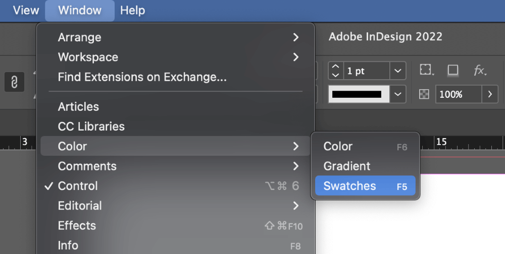
It’s visible in most of the InDesign default workspaces, but if your Swatches panel is hidden, you can bring it up by opening the Window menu, selecting the Color submenu, and clicking Swatches. You can also use the keyboard shortcut Command + F5 (just use F5 if you’re on a PC).
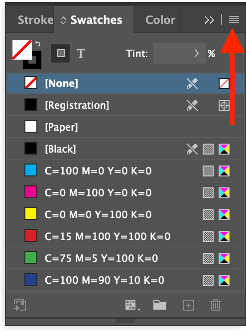
Once the Swatches panel is visible, open the panel menu (as shown above) and click New Gradient Swatch. InDesign will open the New Gradient Swatch dialog, which allows you to completely customize your gradient.
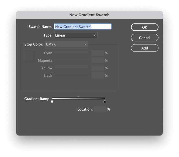
Start by giving your gradient a memorable or descriptive name, and then select the gradient pattern you want to use from the Type dropdown menu.
Linear gradients progress along a straight line, while Radial gradients start at a central point and progress outwards equally in all directions, similar to the glow from a point light source.
(If you’re not sure which one to choose, don’t worry about it too much because you can always come back and adjust it later if you need to.)
The Gradient Ramp section illustrates your current color gradient. Each color in your gradient is known as a stop, and you can add as many stops as you want. The default gradient has a white stop and a black stop, which creates a simple white-to-black gradient.
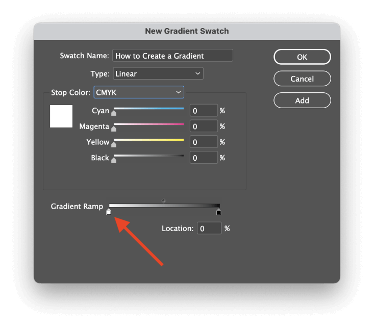
You can select one of the existing stops in the gradient to change its color or position. Click the stop you want to change, and the Stop Color section above will activate, allowing you to adjust the colors.
To add a stop to your gradient, click the approximate spot in the Gradient Ramp where you want to add the new color, and a new stop will be created.
You can also use the Location field to position each stop precisely using percentages, which can be helpful if you want to have a perfectly consistent progression across multiple stops, although you’ll have to do a little basic math since InDesign has no additional tools for distributing or arranging stops.
Each pair of stops also has an adjustable midpoint that controls how quickly the colors change between the two stops (highlighted below). Since I’ve added two additional colors to my gradient, there are now three midpoints, one for each pair of stops.
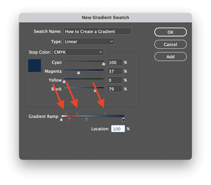
To remove a stop from your gradient, click and drag the stop arrow out of the Gradient Ramp area, and it will be deleted.
When you’re satisfied with your gradient, click the OK button, and you’ll see a new entry in the Swatches panel with the name you gave it.
Applying Gradients in InDesign
Once you’ve fine-tuned your gradient until you’re satisfied, it’s time to test out your new colors! You can use your new gradient swatch as a Fill color or even a Stroke color, but if you apply it as a swatch, you won’t be able to control the angle or placement of the gradient.
The best way to apply your newly-created gradient is with the Gradient Swatch Tool!
Make sure your object is selected, then switch to the Gradient Swatch Tool using the Tools panel or the keyboard shortcut G.
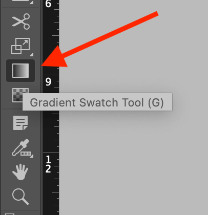
Then just click and drag to place your gradient! InDesign will draw a guide indicating the current angle of your gradient, and when you release the mouse button, you’ll see your newly positioned gradient.
You can repeat this process as many times as you like until you’re happy with how it looks – just keep in mind that each time you use the tool, you’re adding a new Undo step.
You can even apply gradients to multiple objects at the same time, as long as you select them all first before using the Gradient Swatch Tool!
Method 2: Use Feather Effects to Create a Gradient
If you want to create a gradient fade effect around an image or other graphic, you won’t be able to use a gradient swatch to make it happen.
Instead, you can create a gradient fade using one of the Feather effects from the Effects panel. They all produce similar results, but they each have their own slight variations and level of complexity.
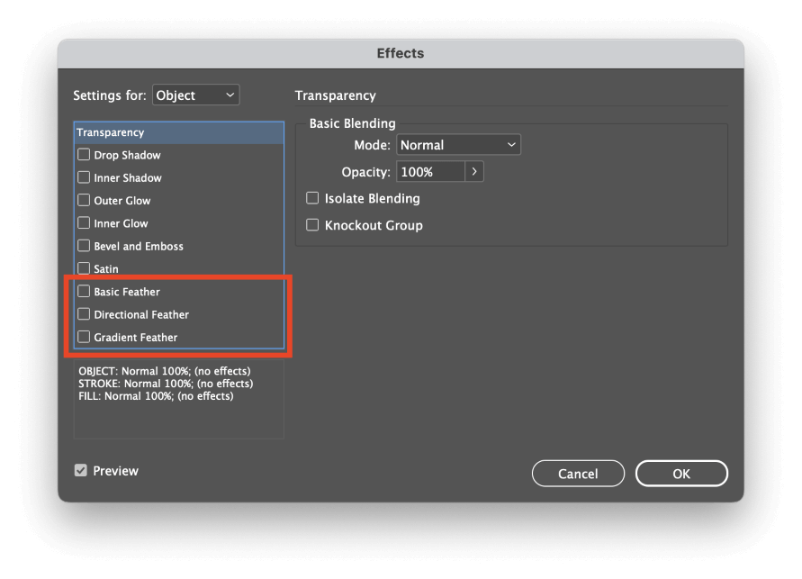
Right-click on your graphic to open the popup context menu, select the Effects submenu, then click any of the Feather entries in the list, and they will all open the Effects dialog window. The three feather effects are listed at the bottom of the Effects panel list, as highlighted above.
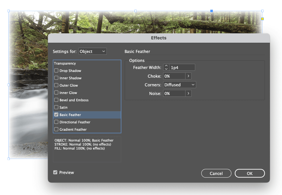
Basic Feather creates a simple fade effect around every edge of your selected graphic.
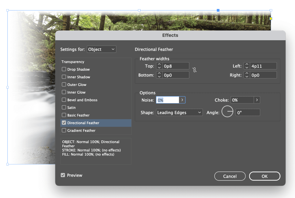
Directional Feather allows you to control the amount of fade separately for each edge and even give it a slight angle.
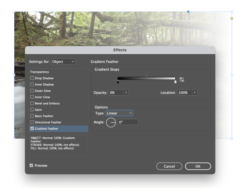
Gradient Feather also allows you to create a fade effect, although you can completely control the rate and progression of the fade using a gradient system similar to the one in the Swatches panel.
This gradient only affects transparency, but you can still modify the progression and fade amount using the Opacity and Location sliders to adjust the stops and midpoints.
It’s also possible to combine the three feather effects in any way you want to create more complex fades, but at that point, it may be a better idea to create the effect using Photoshop or another photo editor.
FAQs
Gradients are such a popular design tool that many users have additional questions about how to use them in their InDesign projects. Here are a few of the most frequently asked!
How to fade a shape in InDesign?
You can fade a shape using the same technique used to fade an image or other graphic element that I described earlier. Basic Feather, Directional Feather, and Gradient Feather (or some combination of the three) should be able to fade any shape the way you want.
How to make a color gradient transparent in InDesign?
The simplest way to make a color gradient transparent is to apply the gradient to an object and then make the object itself transparent using Effects. Right-click on the object to open the popup menu, then select the Effects submenu and click Transparency. Lower the Opacity setting to make your object partially transparent.
Can to change gradient opacity in InDesign?
It is not possible to change the opacity of individual stops within a gradient, but it is possible to add partially transparent fades into a gradient.
Add a new stop, then open the Stop Color menu and select Swatches. Select the special Paper swatch, and your gradient colors on either side will fade into blankness. The Paper swatch tells InDesign that no ink should be printed, so while it’s not quite the same as truly changing gradient opacity, it’s the next best thing.
A Final Word
That covers the basics of how to create a gradient in InDesign, as well as how to create a gradient fade effect on images and shapes. Just remember that InDesign isn’t intended as a drawing app, so your gradient options are a bit more limited than they are in Illustrator or another dedicated vector drawing app.
Happy drawing!