If you have a set color palette for your work, manually selecting colors with the color picker is not only a drag but completely unnecessary. Creating color palettes in Adobe Illustrator is easy by using Color Picker, Image Trace, and Adobe Color. All you need is a few minutes to spare.
My name is Elianna. I have a Bachelor of Fine Arts in Illustration and have used Adobe Illustrator for over six years. I use Illustrator to create posters, illustrators, business cards, and more.
In this article, I will show you three ways to create custom color palettes in Adobe Illustrator using Swatches, Image Trace, and Adobe Color.
Let’s get into it!
Table of Contents
Key Takeaways
- Color harmonies refer to combinations of colors and include harmonies like analogous, complementary, monochromatic, and more.
- To save your swatches click on the Swatch Library icon in the Swatches panel and select Save Swatches.
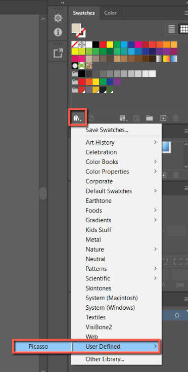
- You can find your saved swatches under User-Defined in the Swatch Library.
- You can share color groups of five swatches with Creative Cloud.
- Use Window > Libraries to open the Libraries panel to find Adobe Color swatches.
Color Harmony
In Color Theory, color harmony refers to combinations of colors that produce a harmonious effect based on relationships on the color wheel. Here are some examples of the most popular and widely used color harmonies:
| Analogous | Includes 3* hues positioned next to each other on the color wheel. An example would include yellow, yellow-green, and green. |
| Monochromatic | Includes tints and shades of a single hue to create a color palette |
| Triad | Includes three colors evenly spaced on the color wheel. This creates a vibrant color palette. An example of a triad harmony includes the primary colors red, yellow, and blue. |
| Complementary | Use colors on opposite ends of the color wheel, and can include primary, secondary, and tertiary colors. Come examples of complementary color harmonies include red and green, orange and blue, and purple and yellow. |
| Split-Complementary | Includes one key color and two colors next adjacent to the key color’s complement. Usually produces a vibrant color contrast. An example of a split-complementary palette is blue (key color), orange-red, and orange-yellow. |
| Square | Includes four colors evenly spaced on the color wheel. This will usually produce a palette with two complementary pairs. |
Many of these aforementioned color harmonies will be the foundations for your color palettes. Study color theory and harmonies to improve your color sense and direction when choosing colors for your palettes.
Method 1: Color Picker
The easiest way to create a color palette is to create a new swatch folder and use the color picker. Here’s how to do it:
Step 1: Import a photo, or open a document that you would like to base your color palette on. I’m using this work of Picasso.
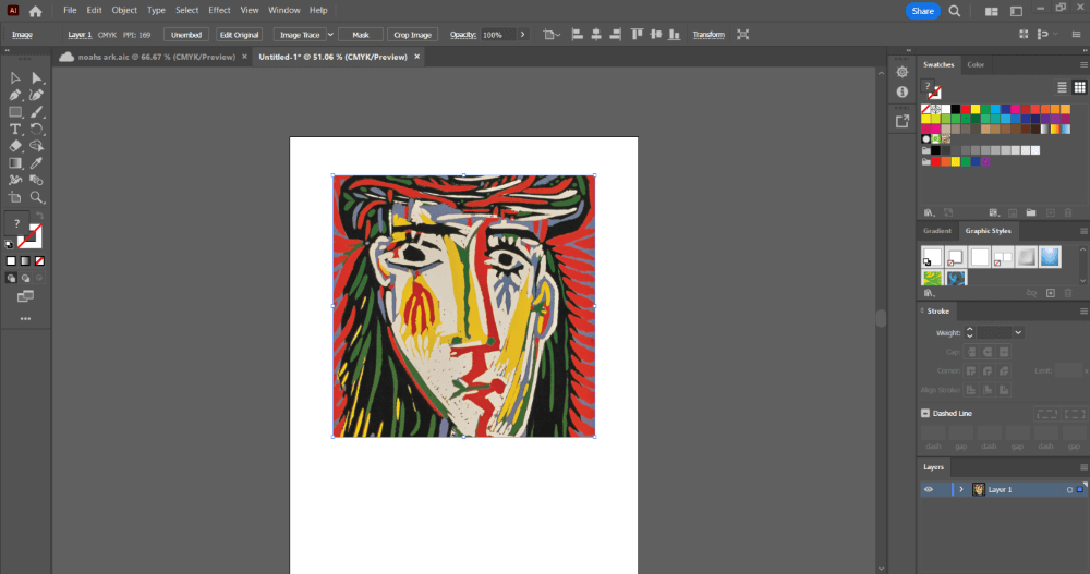
Step 2: Click on the Folder icon in the Swatches panel to make a New Color Group. Name it and press OK.
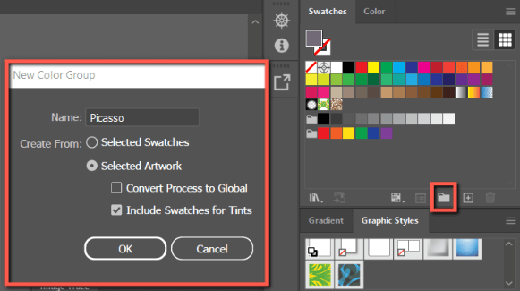
Step 3: Click on the eyedropper tool and select a color of choice for your artwork.

Step 3: In the Swatches panel, click on the New Swatch icon.
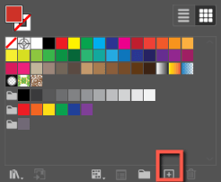
Step 4: Your swatch will appear in the swatches panel. Repeat as many times as necessary.
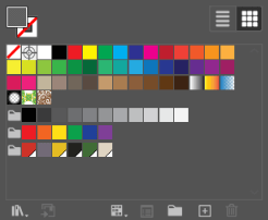
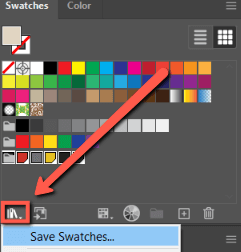
Step 5: When you are done making your palette, click on the Swatch Library icon and select Save Swatches.
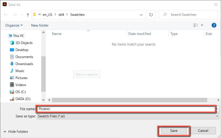
Step 6: Name your swatch group and click Save.
Step 7: To access your swatch library in future designs, hit the Swatch Library icon, and find your custom palette under User Defined.
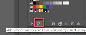
You can also add your color group to your libraries with the Add Select Swatches and Color Groups to my Library icon. Just note that this option is limited to 5 swatches. Skip to Step 5 in Method 3: Use Adobe Color to learn how to access it in the Libraries panel.
Method 2: Image Trace
If you have a photo with a color palette you would like to use, you can create a color palette from it easily by using Image Trace. Here’s how:
Step 1: Import your image in Adobe Illustrator by opening it through File > Open, or with File > Place (shortcut Ctrl + Shift + P). I’m using this image by Picasso.

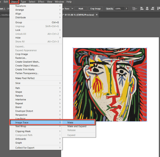
Step 2: Open Image with Object > Image Trace > Make.
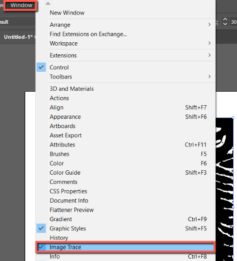
Step 3: Open the Image Trace menu with Window > Image Trace.
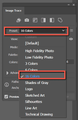
Step 4: Change your preset to 16 Colors.
Step 5: Click on your object and select Object > Expand.
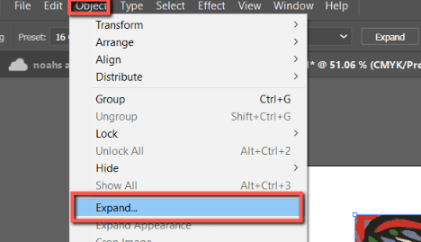
Step 6: With Object and Fill selected and click OK.
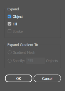
Step 7: With your image still selected, click on the Folder icon in your Swatches panel.

Step 8: Name your color group and check Select Artwork in the Create From options. Hit OK.
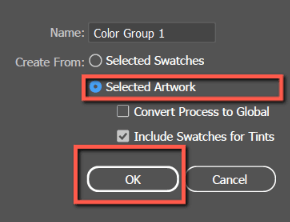
Your custom palette will appear in a folder in your Swatches panel.
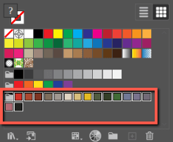
Method 3: Use Adobe Color
Adobe Color allows you to create and share color themes (palettes) with the ability to save them for use in a variety of apps like Photoshop and Illustrator. It comes with most Creative Cloud subscriptions and can be a useful tool for quickly creating new color themes.
This tool is perfect for creating palettes that you may share with colleagues, team members, or clients, as you can share your color themes by email invitation. Color themes can also be used as brand assets in software like Adobe Express.
Here’s how to do it:
Step 1: Log into your creative cloud account and go to https://color.adobe.com/create/color-wheel to access Adobe Color.
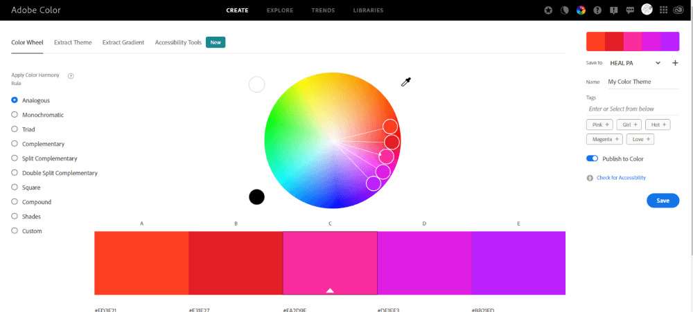
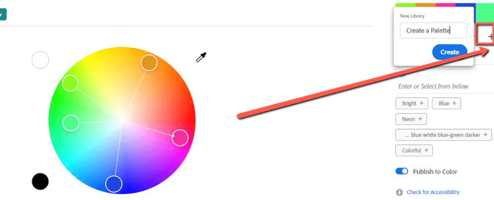
Step 2: Click on the + icon to create a new Library. Name it, and press Create. This is where you will save your palettes, which will sync to Adobe Illustrator. I’m naming mine Create a Palette.
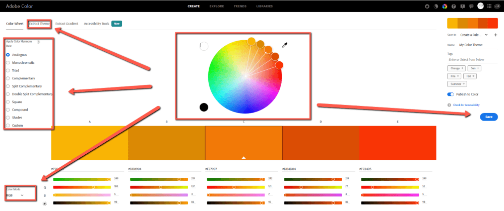
Step 3: Use the color wheel to select colors manually. Select a field on the left to apply a Harmony Color Rule. Click Extract Theme to create a color palette from a photo. Switch your color mode between RGB and CMYK in Color Mode.
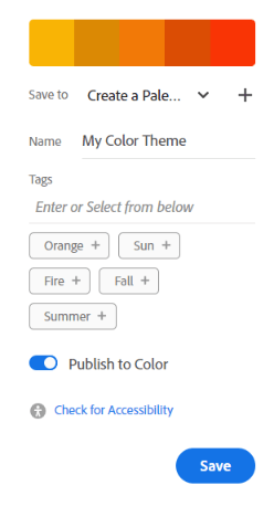
Step 4: When you are satisfied with your color palette, click Save.
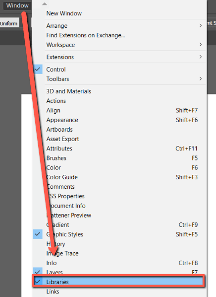
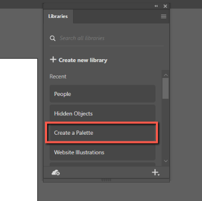
Step 5: Open Adobe Illustrator. Use Window > Libraries to open the Libraries panel.
Find your library on the list. Click it.
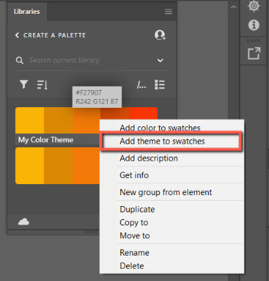
Step 7: Right-click on your color palette and select Add theme to swatches.
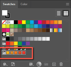
Your swatches will now appear as a new color group in the Swatches menu and you can use them.
Final Thoughts
Creating your own color palettes in Illustrator can increase your design workflow and save you frustration. With the Color Picker, Image Trace, and Adobe Color you can create palettes from scratch or from photos to save to your computer and easily share with others in the Creative Cloud.
Experiment with Adobe Color to expand your knowledge of the Creative Cloud and how you can make palettes to use across all of your Adobe Apps in a few clicks. Remember that all custom assets and color palettes will show in the Libraries panel of your Adobe programs.
Do you have another method to create color palettes in Adobe Illustrator? Tell me in the comments below!
