
Color management can be one of the most difficult aspects of graphic design, but it can also be the difference between a work of art and a disastrous misprint.
The whole situation gets even more complicated when you learn that InDesign doesn’t use color modes in the same way as other Creative Cloud apps like Photoshop and Illustrator.
Table of Contents
How Color Modes Work in InDesign
InDesign is intended as a “final stage” layout program that brings all your prepared elements together, not for doing color adjustment work.
So rather than setting the color mode for your entire document, color modes in InDesign are specified at the object level. It’s possible to have an RGB image next to CMYK color text over a logo that uses a Pantone spot color.
This might seem counterintuitive, but it all falls into place when you remember that InDesign’s primary export format is PDF.
During the export process, all images and colors within the document are converted to the destination colorspace you’ve selected for the output file, regardless of their original color mode. Even if you export your spreads as JPG files, the final colorspace is still determined during the export process.
Setting the Default Color Mode in InDesign
Despite the fact that different objects can use different color modes, it’s possible to tell InDesign whether it should use RGB or CMYK color modes as the default display type for the Color Picker dialog window, as well as for the Swatches and Color panels.
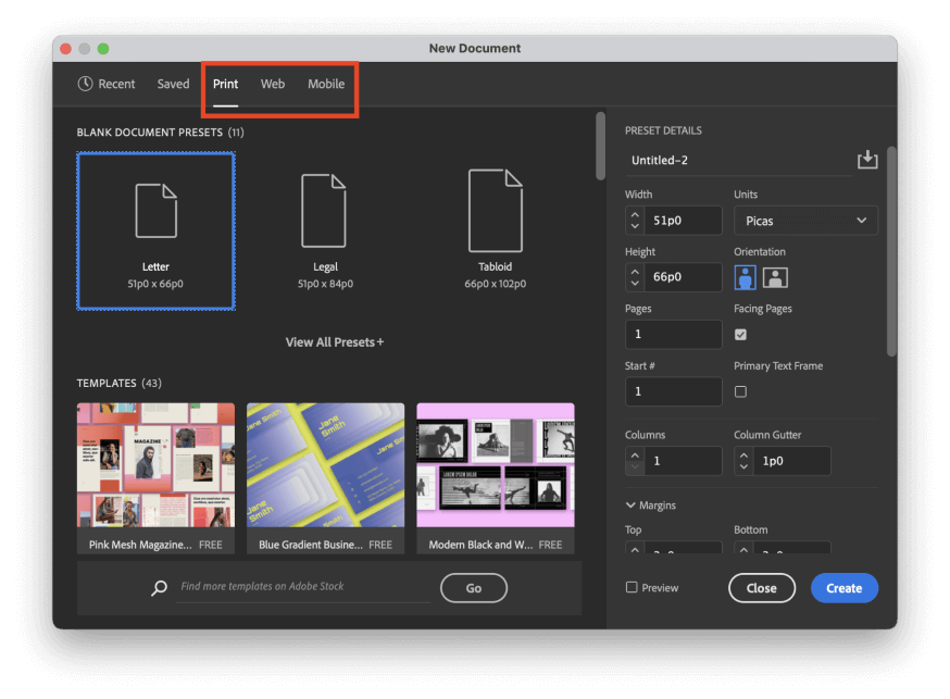
While creating a new document, if you select a preset from the Print section, InDesign will default to using the CMYK color mode. If you select a preset from the Web or Mobile sections, InDesign will assume that you want to make all your color choices in the RGB color mode.
If you change your mind after creating your document, you can adjust this by opening the File menu and clicking Document Setup.
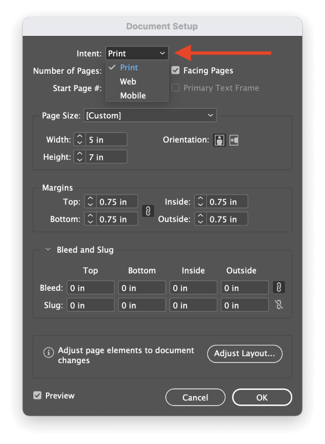
Open the Intent dropdown menu, and select Print to default to CMYK, or select Web/Mobile to default to RGB.
Remember that these changes only simplify the user experience to make color picking faster. You can still export your document into any color space you want.
Change Color Modes While Picking Colors
Regardless of what new document preset or Intent setting you use, you can select colors in InDesign using any color space that you want. InDesign supports RGB, CMYK, Lab, HSB, and Hexadecimal color modes, and you can define your colors using any of these options in the Color Picker dialog window.
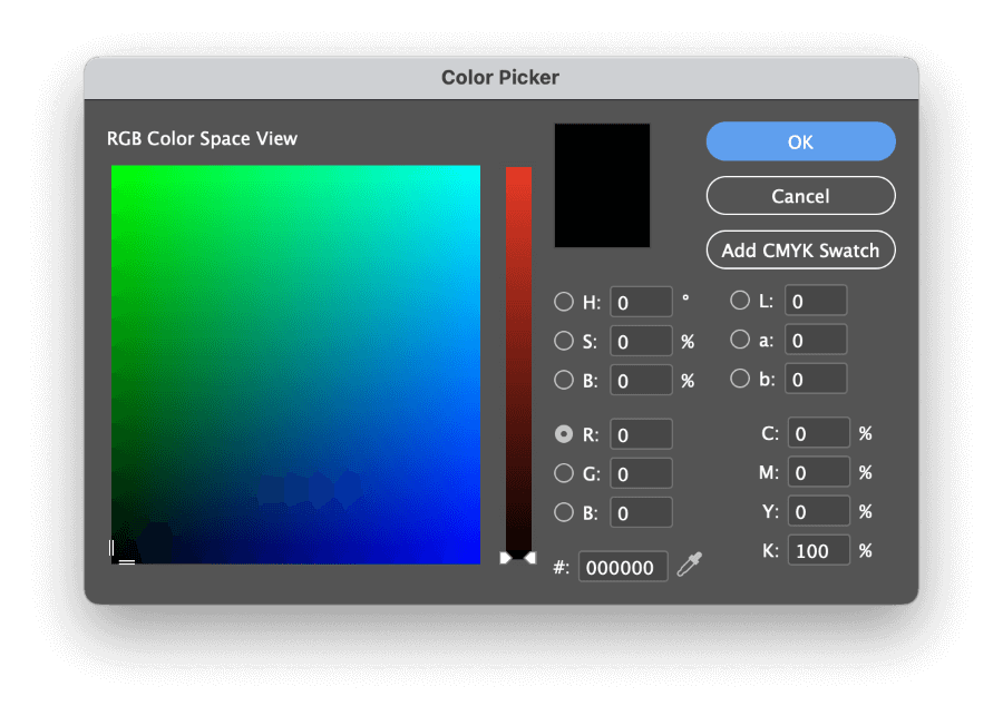
Double-click any of the color swatches throughout the interface to open the Color Picker dialog window.
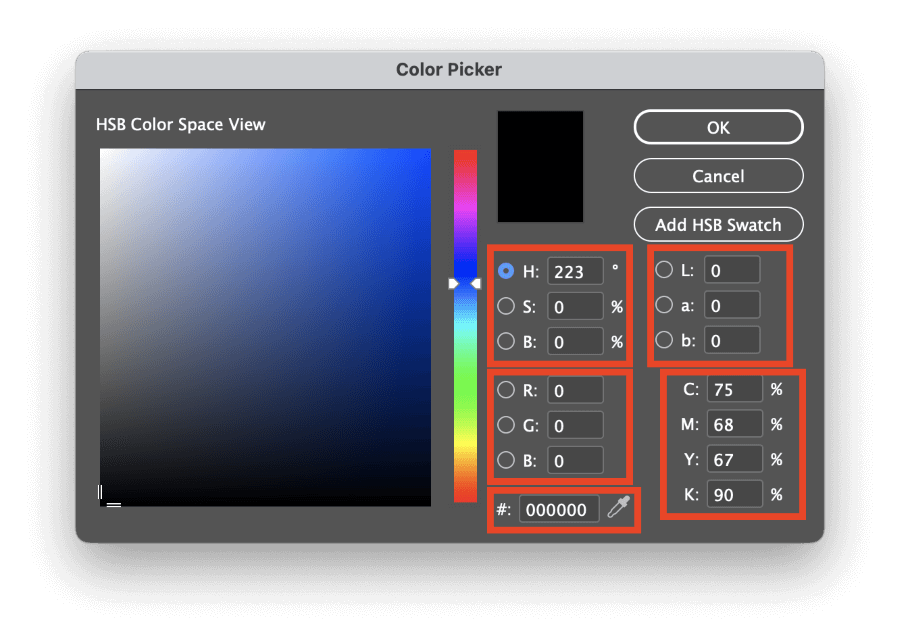
The default colorspace view will match the current setting in the Color panel, but you can easily display different color space views by selecting a different radio button from one of the other color spaces in the Color Picker window.
CMYK and Hexadecimal don’t have color space views in the Color Picker dialog, but RGB, Lab, and HSB can be used to select colors visually.
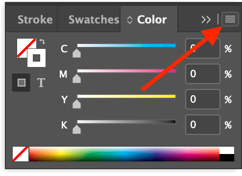
If you’d prefer not to use the Color Picker dialog, you can also use the Color panel to enter new color values and see a minimized preview of any adjustments. You can change the color mode used by the Color panel by opening the panel menu and selecting the appropriate color mode.
Specialized Color Modes With Swatches
If you want to use a specialized color mode, such as a Pantone spot color, you’ll need to use the Swatches panel. If it’s not already part of your workspace, you can make it visible by opening the Window menu, selecting the Color submenu, and clicking Swatches. You can also use the keyboard shortcut F5.
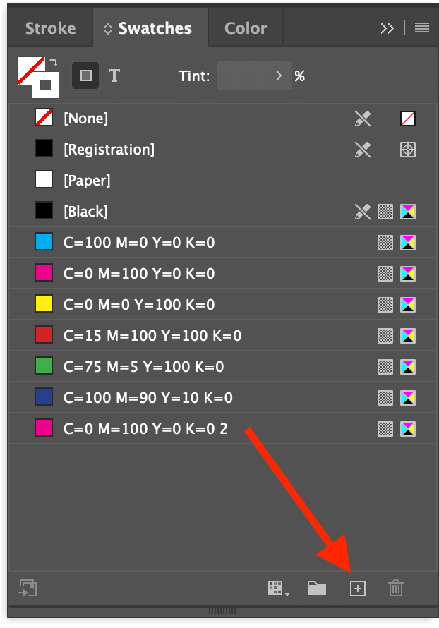
Click the New Swatch button at the bottom of the panel, and InDesign will add a new swatch to the list. Double-click the new entry to begin adjusting the color values.
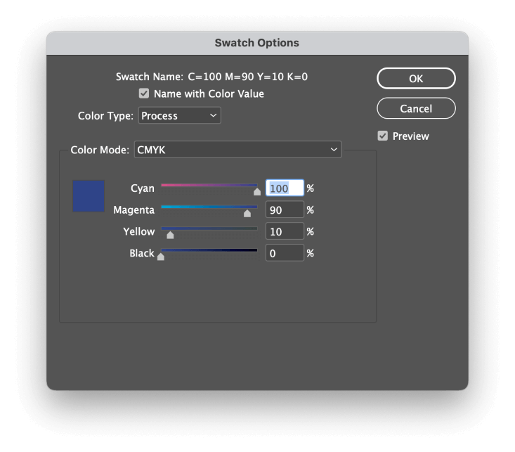
In the Color Type dropdown menu, you can select either Process or Spot. Process will attempt to create the color using your chosen color destination color mode, while the Spot setting will assume that your printer will be configured to use a specialized pre-mixed ink.
Typically, most document colors are process colors, but some branding initiatives demand specific spot colors for precision and consistency in elements like corporate logos (among other reasons).
Spot colors can be tricky to work with, so don’t select this option unless you’re absolutely certain that you need it.
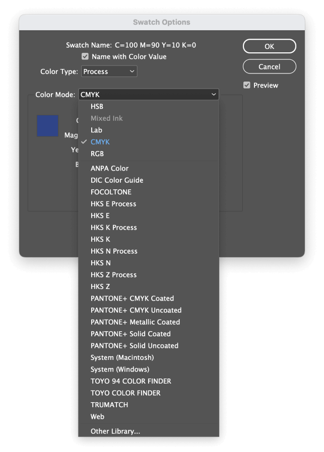
Next, open the Color Mode dropdown menu. As you can see, the standard color modes are available at the top of the list, but there is a huge range of other color palettes that you can choose from.
Once you’re satisfied with the color settings, click OK, and you’ll be able to use your specialized color mode on any element in InDesign.
Changing Color Modes When Exporting PDFs
As I mentioned earlier in this tutorial, the final decisions about color mode happen when you’re exporting your InDesign document to another format for sharing and display purposes. Most of the time, you’ll probably be using PDFs as your output file, so let’s take a quick look at the PDF export settings.
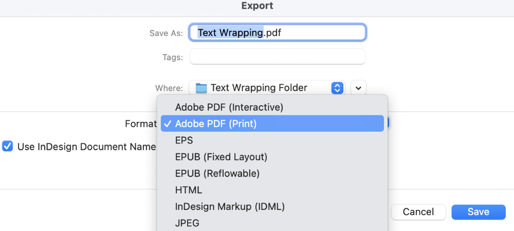
Open the File menu, and click Export. In the Format dropdown menu, you can select either Adobe PDF (Print) if you’re preparing a print document or Adobe PDF (Interactive) if your document is going to be viewed on screen.
If you select Adobe PDF (Interactive), then InDesign will assume you want to use the RGB color mode, and InDesign will use the default RGB working space.
If you select Adobe PDF (Print), you’ll get a bit more flexibility during the export process. Name your file, and click Save. InDesign will open the Export Adobe PDF dialog.
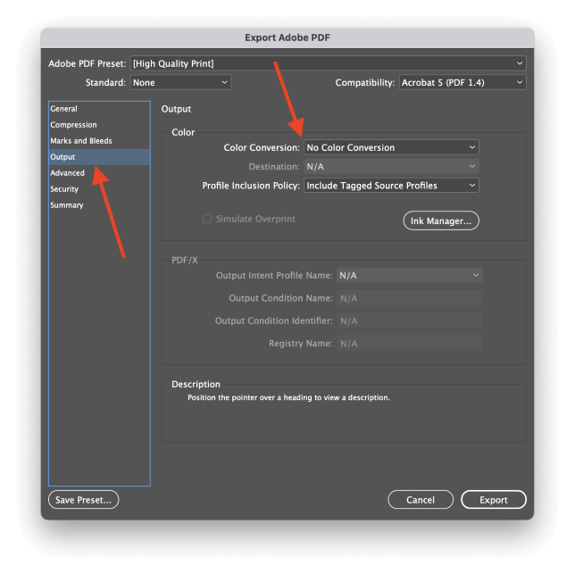
Select the Output tab from the list on the left, and you’ll be presented with all the color mode conversion options for your output file.
Open the Color Conversion dropdown menu, and select Convert to Destination.
Next, open the Destination dropdown menu, and select the appropriate color profile for your intended usage.
If you’re in North America and working on a print project, U.S. Web Coated (SWOP) v2 is probably the most common profile, but you should always check with your printer to see if they have specific requirements.
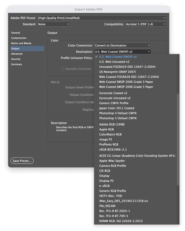
If you’d prefer to convert your document for on-screen viewing, selecting a standard RGB color profile such as sRGB is usually the best choice.
Be sure to double-check your output file to make sure that it looks correct!
A Final Word
That covers everything that you’ll need to know about changing color modes in InDesign! While a properly color-managed workflow sounds like a daunting prospect, it will guarantee that your InDesign documents look the way you intended them to every time, no matter where they’re on display.
Happy coloring!