
Even if you didn’t know the term, you’ve probably seen drop caps many times in books, magazines, and even some websites.
Adding drop caps to your text is extremely simple in Adobe InDesign, whether you want to do a classic drop cap or a fancy image-based drop cap like an illuminated manuscript from the 1400s.
Here’s how to use them in your next project!
Table of Contents
Adding a Simple Drop Cap in InDesign
For the purpose of this tutorial, I’m going to assume that you’ve already added your text to a text frame in your InDesign document. If not, that’s the first place to start!
Once your text is entered and prepared, click somewhere within the first paragraph to place your cursor. This will tell InDesign to restrict the drop cap effect to the first paragraph, or else every single paragraph will start with a drop cap, and that’s probably not what you want to do.
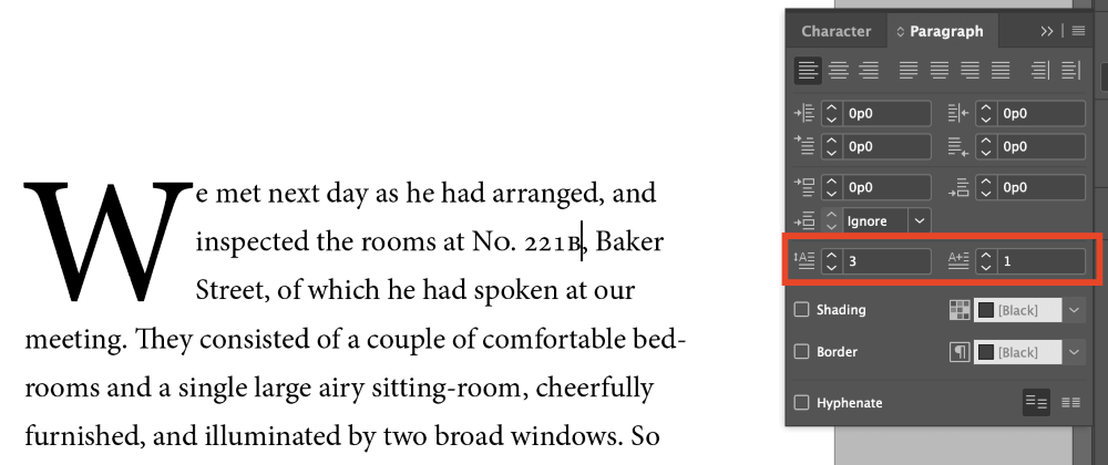
Open the Paragraph panel, and locate the two fields highlighted below. Note: if the Paragraph panel isn’t visible in your workspace, you can open it by pressing the keyboard shortcut Command + Option + T (use Ctrl + Alt + T if you’re using InDesign on a PC). You can also open the Window menu, select Type & Tables, and click Paragraph.
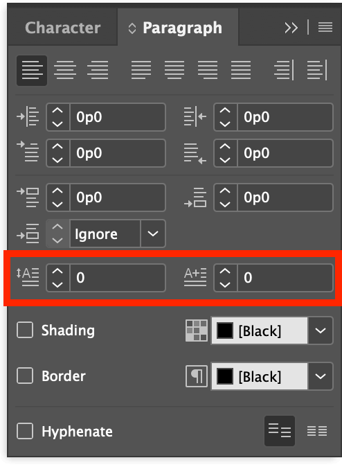
These two fields control your basic drop cap settings. Drop Cap Number of Lines controls how far down your cap will drop, and Drop Cap One or More Characters controls how many characters get the drop cap treatment.
If you want to get a bit fancier, open the Paragraph panel menu and select Drop Caps and Nested Styles.
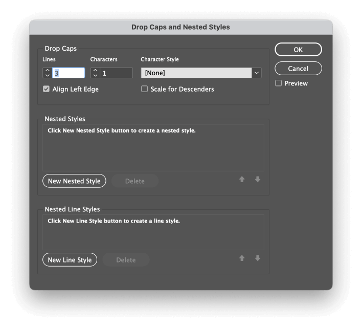
This will open a dedicated panel for combining drop caps and initial line styles, although nested styles are a bit outside the scope of this tutorial.
They can be used to customize the first few words or lines following your drop cap using character styles, which helps to balance out the effect of a large letterform right next to your body copy.
This simple method is fine for short documents with only one or two drop caps. If you’re working on a large document with lots of drop caps, you should consider using paragraph styles.
These style templates are used to help unify the formatting style of your text across an entire document.
This means you can make changes to the paragraph style in one place, and the entire document will update itself to match automatically, so you don’t have to change each drop cap one by one. If you’re working on a long document, this can save you a huge amount of time!
Using an Image as a Drop Cap
If you want to get fancy with your drop caps and you’ve got some illustration skills (or you happen to know a great illustrator), you can use an entire image as your drop cap.
This kind of drop cap usually can’t be applied automatically since it relies on using text wraps, but it’s a great way to add some additional style to your layout.
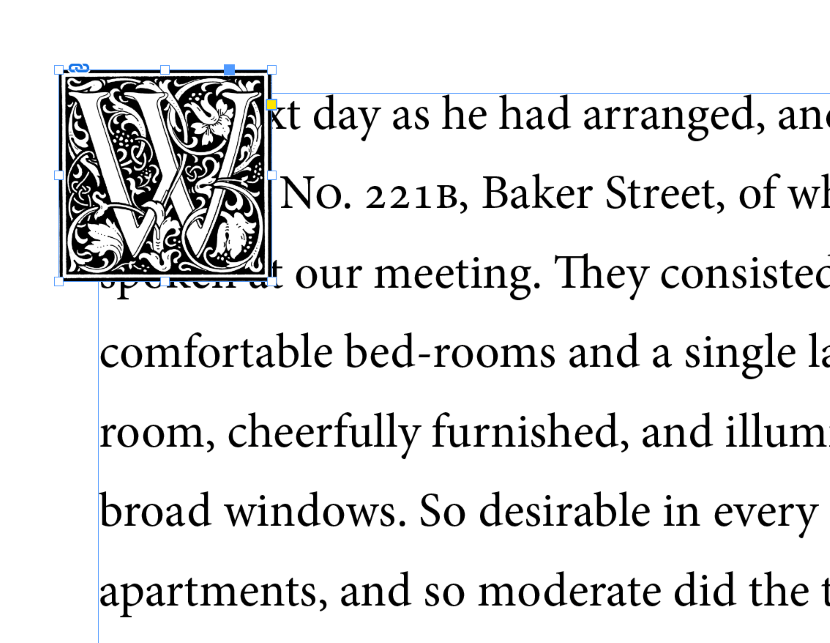
Set your text in a text frame as normal, and then delete the very first letter of the first word in your text. This letter will be replaced by the image you’re going to add, so you don’t want to repeat yourself!
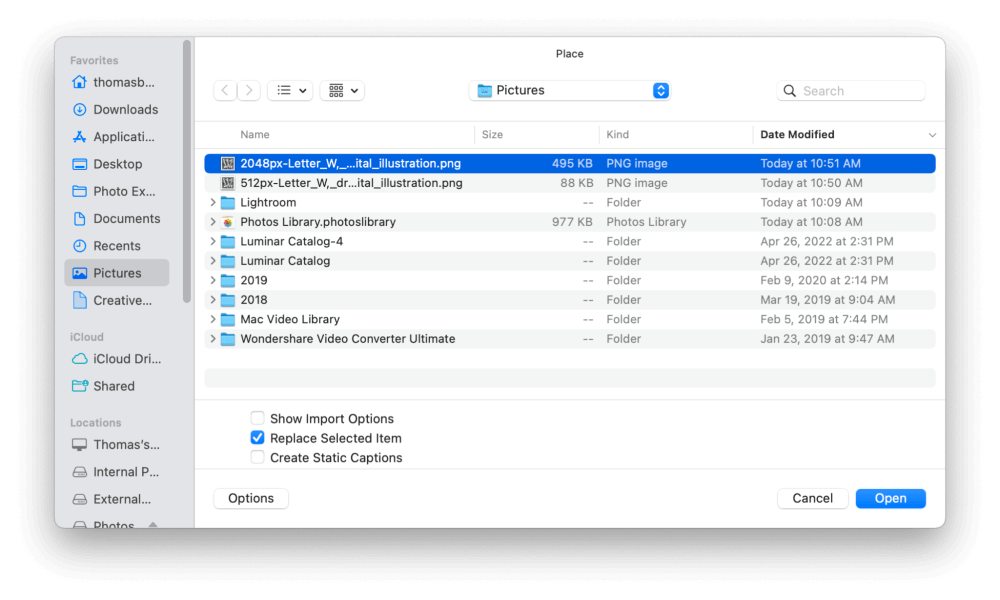
Next, press Command + D (use Ctrl + D if you’re on a PC) to run the Place command, and browse to select the image file that you want to use as your drop cap.
InDesign will ‘load’ your cursor with a thumbnail of your chosen image. Click anywhere in the document to place your image, and then resize it to your desired size. This can range anywhere from two lines of text to the entire page, so don’t stand in the way of your own creativity!
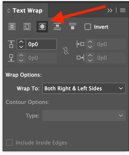
Make sure the image is still selected, and then open the Text Wrap panel. If it’s not already part of your workspace, you can display it by opening the Window menu and selecting Text Wrap.
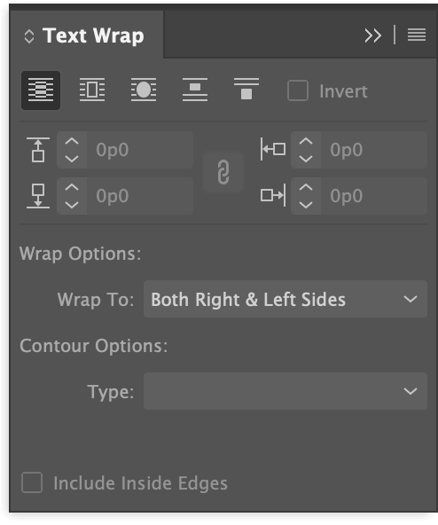
In the Text Wrap panel, you’ll see a number of wrapping options, but the best choice for this task is Wrap Around Bounding Box.
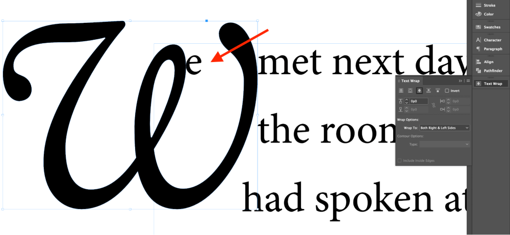
Depending on the structure of your drop cap image, you might also want to try using the Wrap Around Object Shape setting. In my example, Wrap Around Bounding Box is fine.
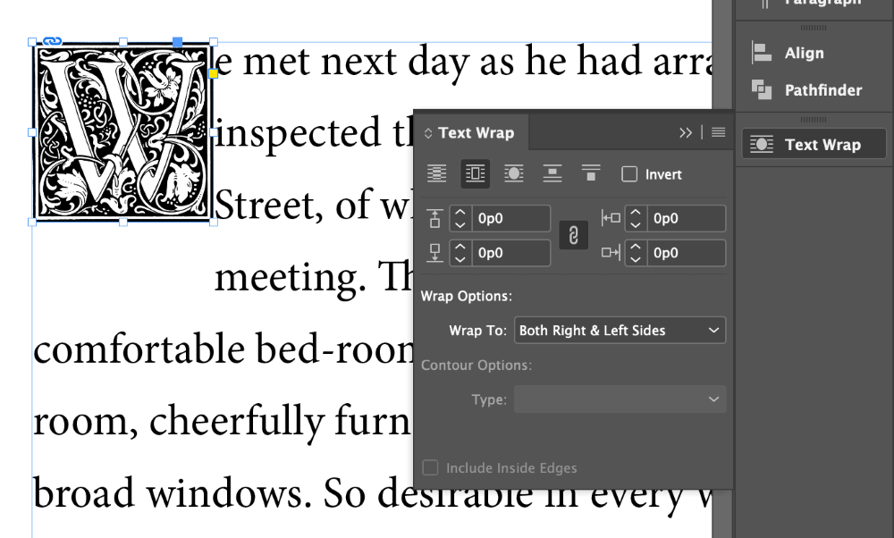
You can also control the spacing around your drop cap image by adjusting the margins in the Text Wrap panel. By default, these values are linked, but you can click the small chain link icon in the center of the panel to unlink them.
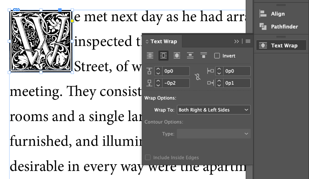
In this case, I’ll add a bit of spacing on the right, and remove some spacing below to stop the fourth line from getting interrupted.
Custom Character Drop Caps
If you want to stick with a text-based cap style but you also want more creative freedom than you get with a basic drop cap, you can combine the two previous techniques by creating a large letterform and converting it into a vector shape.
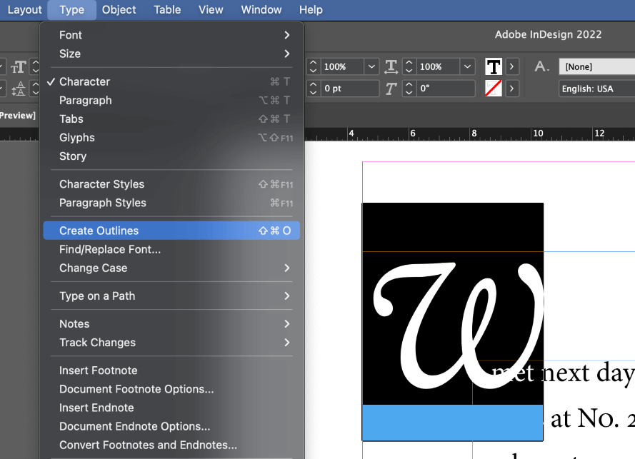
Use the Type tool to create a new text frame, and type the character you want to use as a drop cap. Select the new character, then open the Type menu, and click Create Outlines. You can also use the keyboard shortcut Command + Shift + O (use Ctrl + Shift + O if you’re on a PC).
Your letter has now been converted into a vector shape, although it’s still contained within its previous text frame. It can no longer be edited with the Type tool, so you’ll have to use the Selection, Direct Selection, and Pen tools if you want to make any additional modifications.
Select the drop cap shape with the Selection tool, then press Command + X (use Ctrl + X on PC) to Cut the shape, then press Command + V (use Ctrl + V on PC) to Paste it back into the document, free from its text frame container. Now it can be freely positioned anywhere you want.
Finally, open the Text Wrap panel, and apply the Wrap Around Object Shape option.
If you find that your letters are not playing nice, as in the example above, you can add some offset value in the Text Wrap panel to create a buffer area between the drop cap and your actual text.
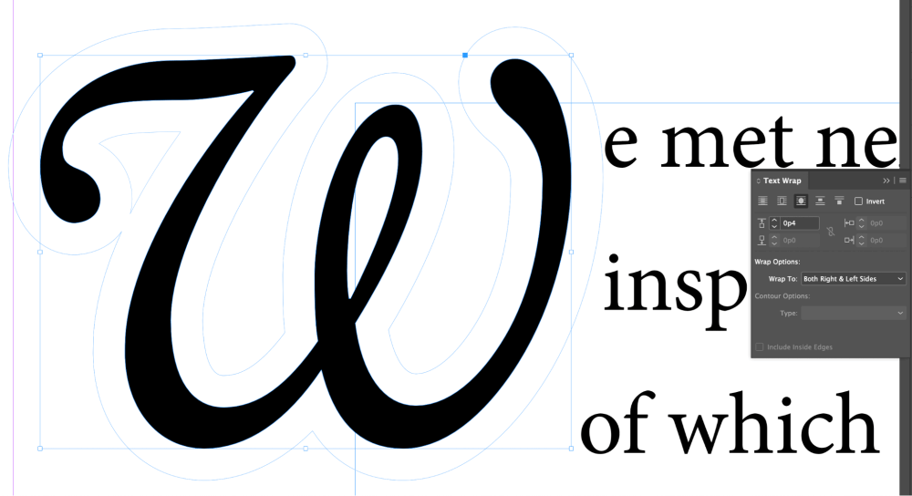
You can even edit this buffer zone using the Direct Selection tool for complete control over your text wrapping.
Freeing your drop cap from the constraints of the text frame is a useful design tactic, but that’s not all you can do with it.
Now that it’s been converted into a vector shape, you don’t have to stick with simple color fills: you can also use it as an image frame! It takes a bit of care to use this in an appealing way, but it’s worth it when you find the right combination of character form and image.
To use your drop cap as an image frame, start by selecting the object using the Selection tool. Next, press Command + D (use Ctrl + D on a PC) to place a new image, and browse to select the file you want to use.
InDesign will give you a loaded cursor showing a thumbnail of your image. Click on the drop cap vector shape to place the image within it. That’s all there is to it!
A Final Word
Now you’ve got the tools to create any kind of drop cap you can imagine! A word to the wise, though: it’s usually better to keep the number of drop caps to a minimum so that they don’t get boring. Using them at the start of each chapter or section is a good place to start, but you’ll have to make the decision for your own design.
Happy drop-capping!