
If you are someone who has been curious about digital or graphic design, you probably have heard of Canva. It has become a primary choice for people to create presentations, invitations, posters, and more due to its extensive library of features and available fonts.
My name is Kerry and I have been creating designs using Canva for many years. It has been one of my favorite platforms to use because it is so user-friendly and has thousands of free features that allow creating easy for anyone!
In this post, I will show you some of my favorite font combinations so that you can save time when trying out fonts for your project. This will help you elevate your projects so that they have a consistent and seamless look to them.
Table of Contents
- Key Takeaway
- The Basics of Font Pairing
- Best Font Pairings in Canva
- 1. Paytone One and Now Thin
- 2. Sukar Black and Tallow Sans Brush
- 4. Playfair Display Black and Karma Bold
- 5. EFCO Brookshire and Donau
- 6. Jorick and Graduate
- 7. Roller Coaster Serif and Awesome Lathusaca
- 8. Lucidity Expa and Wire One
- 9. Moontime and Codec Pro Thin
- 10. Garet ExtraBold and Antic
- 11. Borsok and Para
- 12. Turbo and Brittany
- 13. TT Rounds Neue and Amsterdam Two
- 14. Angelina and Barlow Condensed
- 15. Brixton and Barlow Condensed
- 16. Rigot and Myster
- 17. Lovelace and Quicksand
- 18. Playfair Display and Montserrat Classic
- 19. Pinyon Script and Josefin Sans
- 20. Abril Fatface and Glacial Indifference
- 21. Tan Mon Cheri and Quicksand Light
- 22. Lora and Quintessential
- 23. Euphoria Script and Rafale
- 24. Chewy and League Spartan
- 25. Playlist Script and Montserrat Classic
- FAQs
- Final Thoughts
Key Takeaway
- Font pairing is the process of finding fonts that work well together due to their features.
- Some fonts work well together due to their decorative elements and style – and you will want to balance the fonts to choose ones that won’t overwhelm one another.
- On Canva, there are so many free fonts, but if you find one that you want to use that has a crown attached to it, those are available for Canva Pro or Canva for Teams accounts.
The Basics of Font Pairing
You may be wondering, what exactly is font pairing? Well, it’s the process of finding font combinations that work well together!
With so many fonts out there, you may want to just choose two and immediately combine them within text boxes and projects. However, keeping it simpler can not only save you time, but can elevate your designs by using fonts that work well together due to their style, width, size, and so on.
Best Font Pairings in Canva
A good font can either make or break a design – and when you want to incorporate more than one font within a project it gets even trickier to keep your design consistent with your desired aesthetic.
Here are some of the best font pairings that are available on Canva so that you can get straight to designing!
1. Paytone One and Now Thin
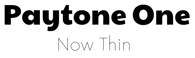
Great for: Standout presentations with headers and descriptions.
Paytone One is a strong and classic font that stands strong in a document or project as a header. Its bold and legible lettering stands as a model for powerful fonts and maintains a presence.
Paired with Now Thin, the contrast allows for a clear distinction between text content and allows for clear reading.
2. Sukar Black and Tallow Sans Brush
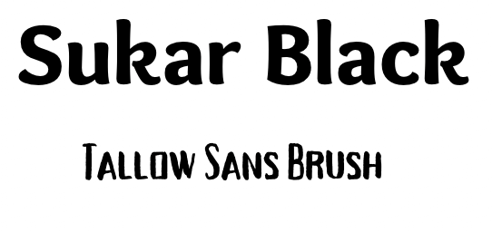
Great for: Modern projects that require bold features.
Sukar Black is a rounded and bold font that stands out as a header. When paired with Tallow Sans Brush, there is a playful contrast between the rounded edges and more pointed line work that creates a nice dissonance between the two, yet is still compatible due to their bold features.
3. Pony Club and Karma Bold
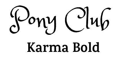
Great for: Stylistic projects that include charm while still highlighting content
The bold and clean font called Karma Bold gives a contemporary yet classic aesthetic when used for text purposes.
Pair it with the playful Pony Club font and you’ll have a standout match that will be sure to capture the attention of viewers. This combination is a unique choice for lifestyle pieces or event notices.
4. Playfair Display Black and Karma Bold
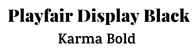
Great for: Standout content projects that require the full attention of a viewer.
The bold type of Playfair Display Black and the more rounded Karma Bold align nicely together as they both create a bold look without overpowering one another. This combination is an excellent option for either presentations or social media posts to make sure that their content stands out.
5. EFCO Brookshire and Donau
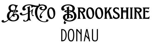
Great for: A retro look that reflects vintage style combinations that will attract the eye yet stay clear of overabundance.
The EFCO Brookshire font has a beautiful and timeless look to it as it is reminiscent of years passed and vintage storefront windows. The combination of that font with an art deco style Donau allows for flourish and style for anyone who wants to capture the attention through the design of the past.
6. Jorick and Graduate
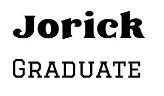
Great for: Article headlines and bylines, magazines, and events
The contrast between the bold and thick Jorick font and the collegiate Graduate font pair nicely together to create emphasis on the first set of text. Each is prominent on its own but creates a strong connection when meshed with one another.
7. Roller Coaster Serif and Awesome Lathusaca
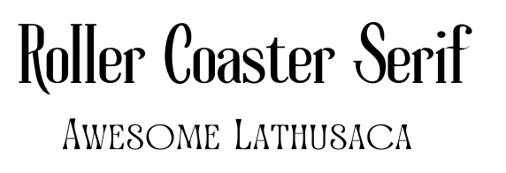
Great for: Stylized projects such as menus, posters, or even notices.
The stylish fonts of Roller Coaster Serif and Awesome Lathusaca create a beautiful and harmonious connection when paired together. This combination is an excellent choice for anyone who wants to attract an audience with stylized lines without being overly done.
8. Lucidity Expa and Wire One
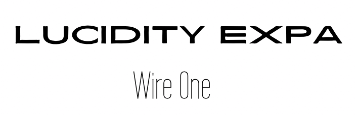
Great for: Modern design graphics such as commercial posts, marketing, and business proposals.
The bold and expansive look of Lucidity Expa with a contrasted squished Wire One allows for a nice contradiction for those who are looking to attract viewers based on incongruity. The bold meets modern aesthetic definitely creates a combination that is attractive.
9. Moontime and Codec Pro Thin
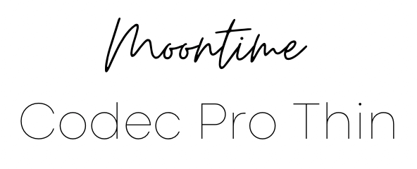
Great for: Boutique and small business.
The combination of Moonshine and Codec Pro Thin is one that messes with a whimsical and bouncy script and a clean, modern, font. This pairing is a fantastic combination for anyone who is looking for a fancy meets practical look. For example, boutiques and small businesses use this style a lot.
10. Garet ExtraBold and Antic
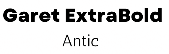
Great for: Basic posters with headers.
This font combination will surely grab viewers’ attention. The thick, bold structure of Garet ExtraBold is an excellent choice for any header or title while the thinner Antic font creates a contrast between text and creates a legible script.
11. Borsok and Para
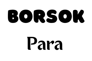
Great for: Children’s books, worksheets, and marketing materials.
This is a fun pairing due to the contrasting styles of Borsok and Para. Borsok is a thick and bold font with bubble-style lettering that is playful and a fun choice. It can totally be used for design projects that have a connection to kids since it gives off such a vibrant look.
When paired with Para, you combine youth and sophistication. This is a unique choice that actually works really well together due to each of their font flairs.
12. Turbo and Brittany
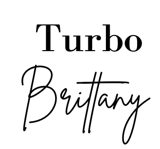
Great for: Menus, marketing materials, product listings, or wedding invitations.
This combination is almost a reversed concept for many of the cursive font pairings that you see normally listed. The bold Turbo font grabs the attention of the viewer and when combined with the loose and twirly Brittany font, is definitely catching the eye.
Pairing these two together allows for a modern and elevated look that you will see in magazines, invitations, and elegant designs.
13. TT Rounds Neue and Amsterdam Two
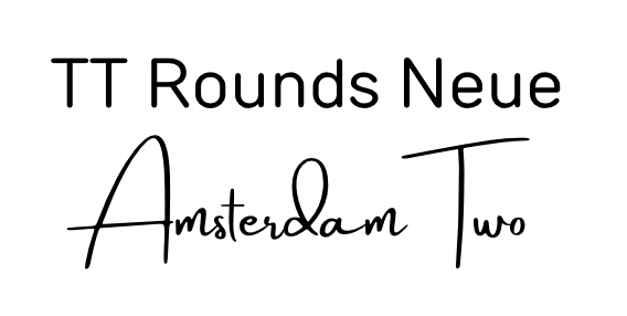
Great for: A basic heading project with a stylish accent.
TT Rounds Neue is another font that seems extremely basic but creates space for some nice contrast when paired with a flared font such as Amsterdam Two. Users can of course switch which font is used first in their text – either adding flair through the extensive content or using the cursive handwriting font as a header.
14. Angelina and Barlow Condensed
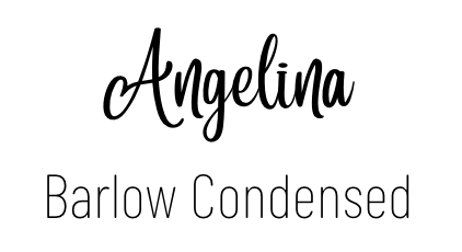
Great for: Invitations, and fancy event posters
The spiraled type of Angelina is so pretty and fun! It adds a bit of whimsy to projects without being difficult to read or painful on the eyes. When paired with a contrasted Barlow Condensed, designers can catch the eyes of the viewer and then provide integral information in a straightforward way.
15. Brixton and Barlow Condensed
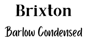
Great for: Casual writing projects.
Barlow Condensed is a quaint font that looks like the handwriting of a casual writer, and when paired with the sharp and bold style of Brixton, it celebrates the classic style of type from years ago with the more modern fonts that are available due to current technology.
16. Rigot and Myster
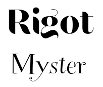
Great for: Artsy and creative projects such as concerts, art shows, or event announcements.
If you look at the combination of Rogt and Myster together, you may get lost in the rollercoaster of swirls and pizzazz. The boldness compared to a daintier lettering style again creates an easy-to-read set of text, yet maintains a creative air and flow that is perfect for anyone looking to add some artsy vibes to their projects.
17. Lovelace and Quicksand
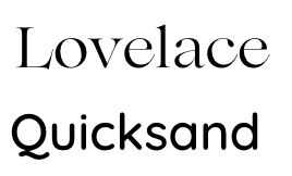
Great for: Any practical project that focuses on the content of the text.
If you are a fan of older styles and classic typography, you will love the use of Lovelace in this font pairing. Delicate yet makes its presence known, this font is a great choice to capture the attention without being in your face.
Quicksand and its curved appearance is basic and clean and practical for many applications, making it a good choice to pair with a more elegant font like Lovelace.
18. Playfair Display and Montserrat Classic
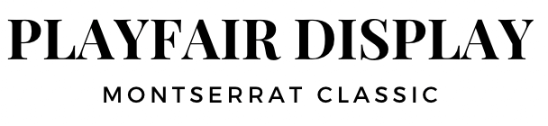
Great for: Any project that requires a bold header, such as an article, announcement, or poster.
Even the name of Playfair Display showcases its ability to become a header or title font. The Serif style font is a classic choice and has been used widely throughout the years since it does this job so well. When paired with another popular font, Montserrat Classic, users will be pleased with the combination of classicism with a modern flair.
19. Pinyon Script and Josefin Sans
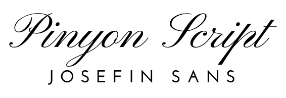
Great for: High-end or luxury product advertisements.
There is no denying that the combination of Pinyon Script and Josefin Sans is a beautiful one. The elegant and classic look of the first font gives the combination an elevated look that is reminiscent of high class. The clear and well-spaced lettering in Josefin Sans allows for a contrast between the two texts, creating a modern dissonance that is quite captivating.
20. Abril Fatface and Glacial Indifference
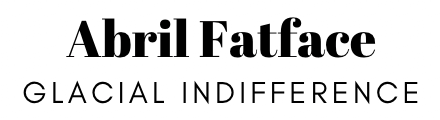
Great for: Marketing materials, headers, and bylines.
Abril Fatface has once again made it to our lists as a strong, bold font that is a great choice for not only titles but for standout words within a set of text. Glacial Indifference and its all uppercase, spaced lettering gives a subtle contrast to the latter, allowing both of them to work together seamlessly within a project.
21. Tan Mon Cheri and Quicksand Light
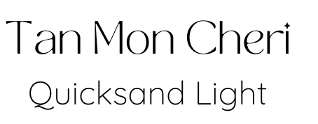
Great for: High-end projects marketing materials, advertisements, or product descriptions.
Tan Mon Cheri is a twist on a classic font with its large lettering, yet remains delicate (and extremely cute with the special dot above lowercase). Paired with a popular Quicksand Light (Quicksand comes in a variety of thickness levels), there is a nice match between the two.
Together, these fonts look elegant and luxurious – perfect for any high-end brand or marketing venture.
22. Lora and Quintessential
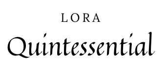
Great for: Menus or event invitations with a modern yet decorous vibe.
The balanced contemporary serif or the Lora font actually has a background in calligraphy style type. It is well-spaced and modern enough to feel a bit more elevated than other popular fonts, and when paired with the calligraphic lettering style of Quintessential, you will be sure to create a pleasing aesthetic for viewers.
23. Euphoria Script and Rafale
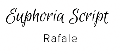
Great for: Invitations, wedding printables, or posters.
What is lovely about Euphoria Script is that it has a flair to it that makes each letter look like actual hand-writings. The added lines on top of letters create a more complete look without having an overly swirly flow as compared to other cursive fonts.
Rafale, in contrast, is a clean and industrial type and is perfect as an added byline or text beneath a beautiful header.
24. Chewy and League Spartan
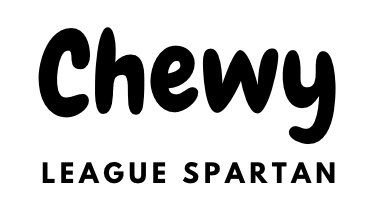
Great for: Advertisements or marketing materials for products geared toward a general audience.
The fun, bubbled, and bold presence of the Chewy font is sure to capture the attention of the public. It makes you feel as though you are included in the type because it looks engaging without being pretentious. The same goes for the League Spartan font. It is clear and inviting, which makes them a perfect pair!
25. Playlist Script and Montserrat Classic
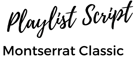
Great for: Book title pages, personalized projects, or lifestyle social media posts.
The beautiful and seamless flow of Playlist Script is not only a top choice for cursive font projects, but looks so personalized as it reminds us of someone’s actual signature. It is a perfect option if you are looking to create a project that is connected to an individual or that you want to make feel like it is coming from a person rather than a brand.
When paired with Montserrat Classic, you will be able to convey information in a straightforward way.
FAQs
If you feel overwhelmed by the idea of font pairings, don’t be! Here are some commonly asked questions about font pairings that might help.
What are the best Canva font pairings for weddings?
Wedding invitations and materials are a common project created on Canva. Some of the best font pairings for weddings are Bodoni and Josefin Sans (for a clean aesthetic), Minna Drop and Kollektif (for a more classic look), and Tan Mon Cheri and Quicksand Light (for an airy and light feel).
What are some good fonts that go with Black Mango?
Since Black Mango is such a strong font (and has multiple options for thickness and bold qualities), fonts that pair well with it include Darker Grotesque (to match the vibe), Quicksand Light (as a contradictory style), and Lovelace (compliments the features).
What are good canvas font combinations for posters?
One of the most classic pairings of fonts for posters is the combination of Arial and Verdana since it is clearly legible while still providing style. Another great font combo for posters is Lobster and Arimo as they complement one another through a bubbly flourish and straight edges.
Final Thoughts
Finding the perfect font for a project can take time, and finding multiple ones that work well together is even harder, but it’s definitely worth the effort! Whether you are looking for more playful combinations, classic choices, or standout pairings, we hope that this list helps you create projects that fit your style!
Do you have any favorite font pairings that we missed in this list? Feel free to share your font pairings, feedback, and thoughts about this topic in our comment section below!