
Today, I’m going to share with you a secret that many photographers are dying to know.
There’s a “look” or rather several “looks” that cause photos to stand out. You automatically know when you see an image edited by a photographer who knows this secret. There’s just something different about the image, though you can’t put your finger on it.
Hey there! I’m Cara and today I’m going to share an editing secret with you that will change your world forever!
In many of those “extra” images you see, that extra special look was achieved with one technique – split toning. This technique is available in various editing programs. Today we’re going to look at where is split toning in Lightroom and how to use it.
Let’s get started!
Table of Contents
What is Split Toning?
So what is this magical editing technique we’re talking about? The Split Toning tool in Lightroom allows you to apply hints of color separately to the highlights and shadows of an image. With a recent Lightroom update, you can also add color to the mid-tones.
There are a ton of effects you can create by applying this technique. For example, the “orange and teal” look popular on Instagram is achieved by adding orange to the highlights and teal to the shadows.
Other popular looks include adding:
- Pink for a blush effect
- Brown for a sepia effect
- Blue to cool the image or create a cyanotype look
- Orange for a golden effect
In some images, the white balance tool just isn’t cutting it. The global change isn’t working. So you can come into the Split Toning tool and add blue to only the shadows and/or orange to only the highlights, etc.
Choosing Your Colors for Split Toning
We’ve mentioned a couple of the more popular colors here, but you can add any color you like. Finding what looks good for your image can be the challenging part.
It can be helpful to think about the color wheel. Complementary colors, which are opposite each other on the color wheel, often work well together. For example, blue and orange, red and green, yellow and purple.
Colors that appear next to each other on the color wheel can also work in some cases. For example, orange and yellow, or blue and green.
It all depends on your image and the mood you want to set. You’ll have to experiment to find what you like.
Note: the screenshots below are taken from the Windows version of Lightroom Classic. If you are using the Mac version, they will look slightly different.
Where is the Split Toning Tool in Lightroom?
The Split Toning tool, known as color grading, is easy to find in Lightroom. In the Develop module, choose Color Grading from the list of adjustment panels on the right side of your workspace.
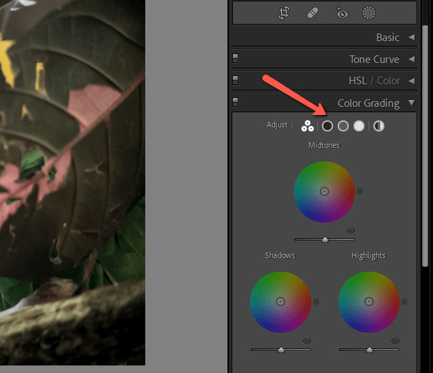
The panel will open with all three (midtones, shadows, and highlights) tools available. Across the top of the panel, you can see your view opens. The three circles together icon is the default view where you can affect all three options in the same view.
The black circle is the shadows, the gray circle the mid-tones, and the white circle the highlights. The multi-colored circle on the right represents global edits you can make to all three at once. Use this option if you want to add the same color to the shadows, mid-tones, and highlights.
How to Use Color Grading/Split Toning in Lightroom
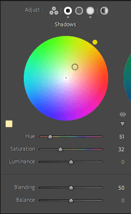
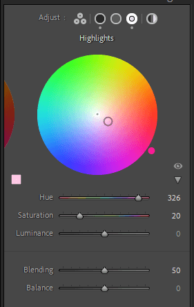
All right, let’s look a little more closely at these controls. There are two handles on each of the circles. The Hue handle rests just outside the circle. Click and drag around the circle to choose your hue.
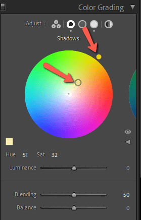
The Saturation handle starts in the very center of the circle. Its position between the edge of the circle and the center determines the strength or saturation of the color. Closer to the center is less saturated and closer to the edge is more saturated.
For my example image, I’ve set the Hue to 51 and the Saturation to 32. You can also click on the Hue and Sat values and type in the number directly if you choose.
You’ll notice that dragging around either handle can affect the other option as well. To restrict the program to only changing the Hue option, hold the Ctrl or Command key while dragging. To only change the Saturation option, hold the Shift key.
Color Swatch and Saving Colors
If you’re working with a few different colors, you can save your possibles in the custom colors box. Click the color swatch to the lower left side of the color grading circle.
Right-click on one of the color swatches and choose Set this Swatch to Current Color from the menu to save the current color. You can also select the saved color from this menu.
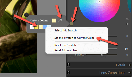
What if you would like to match an existing color from the image? Simply click and hold the eyedropper tool. Then drag around over your image for an instant preview of how each color in the image will look.
Luminance
Here’s an important concept to keep in mind. Lightroom can’t add color to 100% black or 100% white. If you want to introduce color into these areas of your image, you’ll have to use the Luminance slider to adjust the white or black point of the image.
This slider is hidden in the default view. You have to click the little arrow to the right of the color swatch to open the slider. You’ll also get a Hue and Saturation slider, which can be used to adjust these options instead of dragging the handles if you prefer.
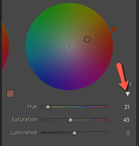
Drag the Luminance slider to the right on the Shadows tool to increase the black point. Drag it to the left to reduce the black point.
Similarly, dragging the Luminance slider to the right on the Highlights tool raises the white point. Dragging it to the left lowers the white point.
Blending and Balance
You may have noticed there are a couple more sliders near the bottom. What do those Blending and Balance tools do for your image?
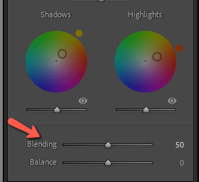
First of all, it’s important to note that these changes are universal. This means that when you slide the Balance slider to 80 in the Shadows tool, the Balance slider in the Midtones and Highlight tools will also change, etc.
Blending controls how much the colors overlap between Highlights, Shadows, and Midtones.
When you slide this up to 100, all three regions spill over into each other. The transition is very smooth but can look muddy depending on the image. Going the opposite direction down to zero makes the blending lines more defined.
Balance deals with how much of the image Lightroom should consider shadow and how much should be considered highlights.
Moving it to the right means more luminance levels will be treated as highlights. Moving it to the left has the opposite effect and more of the image will be treated as shadows.
Hold down Alt or Option key while dragging the Balance slider. This will temporarily boost the saturation so you can see more easily how the image is being affected.
When to Color Grade Your Images
It’s important to keep in mind that color grading is the cherry on top. The best time to tweak this setting is after you’ve already applied your other edits.
This is the tool you turn to when you want to give your image a certain “look” such as the orange and teal look we mentioned earlier. You can also use color grading when adjusting the white balance isn’t giving you the exact tone you want.
Here’s a quick example where I applied a pinkish effect. The first photo is my edited image. The second photo is how it looks after applying pink to the highlights and yellow to the shadows.


The difference is subtle, but that’s what you want. You don’t want overediting to be the first thing a person sees when they look at your image.
Here are the settings I used to achieve this soft pink look.
Ready to Play with Split Toning?
Remember that less is more with split toning. The color you add should boost the look of the image, not overpower it. It’s easy to end up with too much saturation when adding this effect. It’s always a good idea to make your edits, then come back at a different time with fresh eyes to assess the results.
Curious about other powerful editing tools in Lightroom? Check out our in-depth tutorial on how to use the new Masking tools here.