When you’re crafting your first literary masterpiece, the last thing you want to do is spend your time thinking about fonts and font sizes.
There are so many different fonts to choose from in a modern word processor, and most of them are poorly suited to book design. Then when you combine that with just how different words can appear on a screen compared to when they are printed, it can be more than an author wants to deal with – but I’m here to help.
Table of Contents
Key Takeaways
Here’s the quick guide to book font sizes used for body copy:
- Most books for adult readers are set between 9-point and 12-point font size
- Large print books for seniors are set between 14-point and 16-point size
- Children’s books are often set even larger, between 14-point and 24-point size, depending on the intended age group
Why Does Font Size Matter?
The most essential quality of a good book design is its readability. A well-designed book with a proper font style and size will make it as easy as possible for your readers to follow the text naturally.
A font size that is too small will quickly cause eyestrain, and the last thing you want is for people to have a painful experience reading your book!

Consider Your Audience
When choosing the font size for your book, it’s a good idea to match your choice to your target audience. Differences in your audience’s reading ability and visual acuity can make for a wide range of ‘ideal’ font sizes, but there are some generally acceptable size ranges for different audiences.

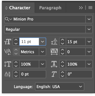
For a typical adult readership, selecting a font size somewhere between 9-point and 12-point should be acceptable, although some designers (and some readers) insist that 9-point is too small, especially for long passages of text.
This is the reason that most word processors default to 11-point or 12-point font size when creating a new document. InDesign also uses a default font size of 12 points.
If you’re preparing a book for senior readers, it’s a good idea to increase the font size by several points to help improve the readability of your text.
If you’ve ever explored the ‘large print’ or ‘large format’ section of your local library or bookstore, then you may already be familiar with the difference this makes when actually reading a book set with a large font size.
Books for children who are just learning to read are also set using much larger font sizes. In many cases, the font sizes used for children’s books are even larger than the standard ‘large print’ size, ranging from 14-point all the way up to 24-point (or even more in some specific usages).
Just like with books aimed at seniors, this large font size dramatically improves readability for young readers who may have trouble following along with smaller font sizes.
Font Size Helps to Create Mood
This is probably the most subtle aspect of choosing a font size for a book, and also part of why it’s hard to list an average book font size. There is also some debate among book designers about how much of an impact this font size/mood relationship has on the overall design.
When dealing with books for a typical adult readership (not for seniors or kids), smaller fonts can help create a sense of refinement and stylishness, although it’s hard to explain exactly why.
Some speculate that using a smaller font “speaks” more quietly, while others argue that this is only a conditioned response created by many decades of design trends.
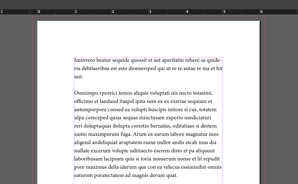
Regardless of the cause, smaller font sizes paired with generous margins and leading (the proper typographic term for line spacing) tend to create a more polished-looking page, while large font sizes with cramped spacing seem loud and brash by comparison. You’ll have to decide for yourself what the ideal look is.
Font Size vs. Page Count
Last but not least, the final point to consider when choosing a font size is the impact it has on the number of pages in your book. A book that’s 200 pages long when set in a 10-point font may be as much as 250 pages when set in a 12-point font, and those extra pages can increase printing costs.
However, the extra pages also create the impression of a longer book, which may be an advantage in some situations.
As with many things in the design world, this means that you’ll have to balance the appearance of your book, the readability, and the printing costs when making your final decision about what font size to use.
A Final Word
Book design can be difficult to master, but hopefully, you now have a better understanding of the average book font sizes for a range of audiences. The final decision is always up to you when you’re self-publishing, but if you submit your manuscript to a publisher, they may have different ideas of what the perfect font size is, so be sure to check their submission guidelines carefully.
Happy typesetting!
